Monday, 12 December 2011

Graphics - Typography

As with the multimedia workshop, we were given a similar theme for the graphics workshop - Organic.
We started off with collecting images from magazines that we thought represented our theme and made a mood board. I chose sections of colour such as blues and greens as well as pictures of flowers, food and things like socks because they link through organic materials like cotton.

Mood Board.
Next, from the mood board I came up with some quick pencil sketches of Initial Ideas.
I then developed them and added colour to see how they would work.
Developed Ideas with Colour.

 I then chose my favourite 2 to develop further. I enlarged them, traced them and scanned them into Photoshop.

Letter J - Enlarged Tracing of Sketch scanned into Photoshop.

Letter Y - Enlarged Tracing of Sketch scanned into Photoshop.
In Photoshop, I used Levels to adjust the contrast and give me a pure black lined image with a white background.


Then on Adobe Illustrator, I used Live Trace, which spilt my image into different sections ready to paint. Before painting, Using the Gap Tool, I checked for small, medium and large gaps. Lastly, I used Live Paint to colour in my Images.

Final Characters:


Multimedia Final Video

This is the second video I made, which is my final version:

Thursday, 8 December 2011

Multimedia

For this workshop, our theme was Natural World.
Firstly, We choose a sentence/quote from a given list, mine was:
"Don't Blow It! Good Planets are Hard to Find!" (Time Magazine).

Next, to gather some ideas I made a spider diagram for the 'Natural World'.

Then using these ideas, I created 2 A3 landscape pages that show a range of mark making by using natural brushes and textures, on Photoshop.

Mark making on Photoshop:  

This was my first experiment, I think it more easily shows what my project is about - the natural world. I tried to include trees, wind, sun (weather), flowers, coral, fish etc.
For my second experiment I tired to make it less of an illustration and slightly more abstract but all the while you still can tell what my image is about. Out of both of them, this is my favourite.
Using the techniques from the A3 sheets and our given sentence I made a small animation on Photoshop. This is the first video I made which is a trial animation using my name. 


Andy Warhol Silkscreen Effect on Photoshop

One of my chosen artists for my Artist Studies is Andy Warhol. I have always liked his Silkscreen Prints, especially his famous Marilyn Series (1962). Therefore I wanted to recreate a similar image but using Photoshop. I chose Johnny Depp because he is one of my favourite celebrities and actors as was Marilyn Monroe for Warhol.

Original Image that Effects are based on.
Image 1 - Colours made to Match Warhol's Famous Marilyn Silkscreen (Blue).

Photomontage of Different Versions of Johnny Depp.

Photomontage of Different Versions of Johnny Depp.

To achieve these effects I followed an online tutorial and this is how I did it:
  1. To recreate the posterized shadows, I selected RGB on Channels Palette and made a new channel - Alpha Channel.
  2. I altered the edge detail by using the High Pass Filter.
  3. Then, I adjusted the Levels to created high contrast. This left me with a posterized black and white image.
  4. Next, using the brush tool I painted away unneeded areas, to give me a crisp and smooth image.
  5. To make the base detail I inverted the image, selected it, placed it on a new layer and filled it in with a base colour.
  6. For each area of colour e.g. Face, Clothing, Sky etc. I created a new layer and using the Lasso Tool I drew roughly around the shape, then filled it in with the Paint Bucket Tool.
  7. Each time I had to make sure the Base layer was on the top.
  8. Lastly to create different versions I use the Hue/Saturation Adjustment and saved each version.

Lomography

This is my own photo I took in London outside Buckingham Palace.
Before.

After.

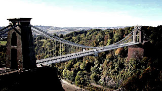
This is a photo of the Suspension Bridge in Bristol that I found online!
Before.

After.

This is a photo I took in NYC.
Before.

After.
 
 
To create this lomographic effect, I firstly cropped my image to 16 x 9 cm and changed its resolution to 300 pixels/inch.
Using the Lasso Tool, I drew a circle around the centre of my image. I then feathered my selection to help blend and and soften my selection.
Next, I inversed my selection and added a new adjustment layer where I changed the levels, once happy with the effect I flattened the image so it returned to one layer. I did the same for a new adjustment layer for curves.
I then added a new layer which I painted black. To make my image visible again, I changed its blending mode to Hue and edited its opacity. This was done to mix greyscale with colour.
I again flatten my image and to finish off, I made my image clearer and easier to see by using the Sharpen Filter.

Tuesday, 29 November 2011

Posterizing & Halftones

Original.

Image 1 - Posterized and Halftone.
Image 2 - Posterized, Halftone and Gradient.


Original.

Image 3 -  Posterized & Halftone.

Image 4 - Posterized, Halftone and Gradient.

Image 5 - Posterized, Halftone and Gradient with Blending Mode - Screen.


To achieve these effects, I firstly used posterizing to reduced the image to just a few colours, in this case 5.
I then, used halftone mode achieve the 'pixel' or 'spotted' effect.
Next, I used layer blending modes and changed the greyscale layer to overlay. This was to bring through the colour. 
Lastly, for my second and forth images I added a rainbow style gradient to add colour. I put this layer in between the greyscale and normal layers. I also changed the opacity of the gradient layer, so the colour was less intense, but left the blending mode on 'normal'. 

My favourite image is Image 1, I think it works better without the Rainbow Gradient.
I also really like Image 5, where I changed the blending mode of the gradient layer to 'screen', it makes it seem like it was a really sunny and bright day.

Duotone Photography

These are edited versions of a photo I took of Pero's Bridge in Bristol.
I first, changed its mode to Greyscale and then adjusted the Duotone. 

Duotone - Sepia Type.

Duotone - Cyanotype. 
Duotone - Black and Purple.
Duotone - Black and Green. 
Photomontage on A3 white. 

Before placing them on the A3 white, I gave each photo a border by firstly adding a white canvas size of 1mm and then adding a black canvas size of 1 cm. 

Tuesday, 22 November 2011

Silhouettes

Image 1 - Beach.

Image 2 - NYC Night Cityscape.

I made both these images in a similar way.
To create a silhouette, I firstly adjusted the curves of my image to make the dark areas of the image black. Using the Magic Wand Tool, I selected the black area. 
Then using Inverse, I reversed my selection and deleted it, leaving me with a black silhouette and white background.
Using the Paint Brush Tool and Eraser I edited my image and filled in gaps in the black areas and cleaned up the white areas. 

Next, I made another silhouette for my first image (the boat) by using the Quick Selection Tool and painted my selection black. I added this image onto my silhouette, rescaled and positioned it.

For the background, I deleted the Background Layer and using the Gradient Tool I added a sunset background on a new layer for Image 1.
And for Image 2, I added a blue colour with the Bucket Tool.

Lastly, to finish Image 2, using the Elliptical Marquee Tool I created 2 circles for the Moon, the top circle filled in with pure white and the bottom one with a white Gradient (to give it a glowing effect).


New Faces

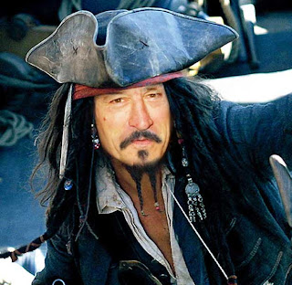
Image 1 - Captain De Niro.


What did I merge?


Image 2 - Kate Monroe


What did I merge?


  • First things first, I collected both my images and opened them in Photoshop. With the Move Tool I placed my new face on to image behind.
  • Next, using Free Transform I moved and rescaled my image to match the image behind. To help me position it I used Guides (which I cleared once I finished).
  • Using the Eraser Tool I started to blend my images. To blend more carefully such as the neck area and hair around the face, I adjusted the Brush Size and Hardness, I later adjusted the Opacity to help blend even more.
  • Lastly I adjusted the Brightness/Contrast and Colour Balance, where it was needed, to help blend and match both images.

Greyscale with Colour

Original.

My Edited Version.


Original.

My Edited Version. 


Original. 

My Edited Version.


Original.

My Edited Version.


Photomontage of all my images.

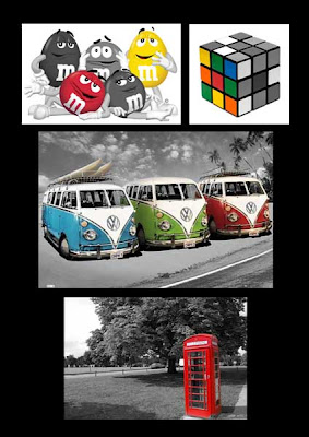
I created these images using Photoshop by duplicating the background layer and desaturating it. Then using the Eraser Tool, and adjusting its size and hardness to fit each image, I rubbed away parts of top layer to reveal the colour on the layer below.

To present the images all together, I created a photomontage on Photoshop by placing each image on an A4 document.
Lastly, I changed the background colour to black to make the images stand out more.


Inverted


This image was originally a light pencil sketch. I scanned it in and cropped it. I then adjusted the levels so that the black was darker and the white was purer, as the creamy colour of the paper was still visible.

I then inverted the image and got the opposite effect.

This is both images mounted on A4 white.