Tuesday, 29 May 2012

Creating a Glass on Cinema 4D


  • This was quite a complicated process! :/ 
  • I used the Bezier Spline Drawing Tool on Front View Mode (Not Perspective View).
  • I sketched out half a glass, starting with the base of the cup at XY 0. It was quite hard to perfect, but luckily the points could be repositioned with the Move Tool.
  • Then I selected the Lathe NURB Object, and in the Object Manager I placed the Spline into the Lathe NURB, this changed the 2D Spline in a 3D Object. 
  • Next I added a Floor Object from the Scene Menu, and repositoned the Glass above the Floor Object with the Move Tool. 
  • To make the glass appear smoother when rendered I increased the Lathe NURB Subdivisions (number of Polygons its made from) to 50 (in the Attributes Manager). 
  • To make the Glass Material I deselected Colour Setting and selected Transparency Setting where I applied a Colour, 50% Brightness and 1.5 Refraction
  • I also selected the Reflection Setting and applied a 25% Brightness
  • And Specular Setting with a Plastic Mode and Width of 27%.
  • I added this material to the Glass Object and a Checkerboard Material to the Floor Object. 
  • To finish I added 2 Omni Light Objects with a 50% Brightness and Soft Shadows instead of one light with 150% Brightness as it caused too much dark shadows. 

Tuesday, 22 May 2012

iPod Movie :)


  • I made this animation/movie on Cinema 4D.
  • Before starting I changed the iPod Screen by replacing it with The Scripts Album. 
  • I added a Circle Path/Spline & a Target Camera.
  • I resized and repositioned my Circle, then selected the Camera and Aligned it To Spline.
  • I then checked the view through the camera to see what view I would get in the animation. 
  • Before starting the animation I changed the frames to 150F so the movie would be 5 seconds long. 
  • At 0F I changed the Position to 0%, I selected Animation & Added Keyframe, then at 150F I changed the Position to 100% and added another Keyframe.

Once finished I Rendered the Animation, and made sure its format was QuickTime Movie. 

Tuesday, 15 May 2012

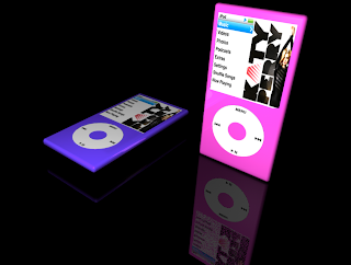
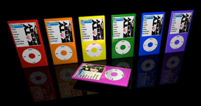
Modelling an iPod using Cinema 4D

In todays session, I made an iPod using Cinema 4D and a bit of Photoshop. 

To start, I added a Cube, and changed the Size and Fillet of the Cube to form the base shape of an iPod.
I then added a Plane Object to form the Screen of the iPod, I also added a Tube Object to form the Wheel of the iPod. 
I resized and repositioned both objects onto the base.
I selected all of the objects and grouped them together into one by selecting Group Objects.

I then created a surface for the iPod to rest on by adding another Plane Object. and resized it to 1000m x 1000m.

On Materials Manager, I created 4 new materials:
One Purple material, for the iPod colour.
One Black material, for the floor.
One textured material where I Uploaded a picture of the iPod Wheel.
One textured material where I Uploaded a picture of the iPod Menu.
Each Material had a Reflection of 20%.

I changed the image of the iPod Menu and added Katy Perry's Single, [she is one of my favourite singers :)] on Photoshop. I did this by cropping the image of Katy Perry's album (to 113px & 168px) and pasting it onto the iPod Menu Image, replacing the previous album. 

I placed each material onto my objects. I then added a Light Object with an Intensity/Brightness of 125% and repositioned it.


First iPod.

2 iPods. I copy and pasted my original image then rotated and repositioned it. I also changed its colour.

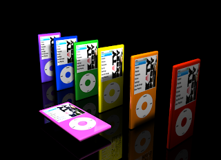
I copy and pasted many versions so I could added more colours. I also added a second light as due to the iPods being very close together, they cast too much shadow. Both lights were too bight so I changed their Intensity to 100%.

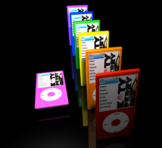
Different view.

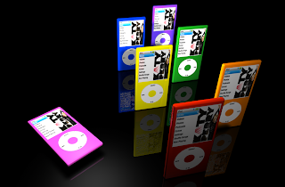
More Repositioning and Rotating.

Repositioned facing forward.


Tuesday, 24 April 2012

Cinema 4D...

Basic Cinema 4D 
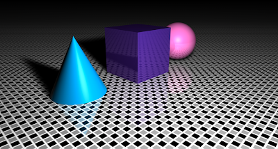
I made these images on Cinema 4D Software.
Image 1
Image 1:
I added a cube, cone and sphere from the Primitive Shapes Menu.
Repositioned them with the Move Tool.
Added a Floor Object. 
On Materials Manager, I created 3 New Materials and made sure each material had a 20% Brightness on the Reflection Menu. I then dragged them to the objects.
For the floor, I choose a Tile Surface Texture instead of a block colour. I edited the tiles colour and dragged it to the Floor. 
To finish I added an Omni Light Object, repositioned it, changed its brightness to 150% and added a Soft Shadow. 

Image 2.
Image 2:
I rotated the Cone. 
I changed the brightness of each object to 50% instead of 20%.
I also changed the texture of the floor surface to Wood, to which I also gave a brightness of 50% so it reflects more into the objects. 
Lastly, I added a second light (but with a 100% brightness) at the back of the objects so the shadow wouldn't be as dark, which is clearly seen when comparing Image 1 and Image 2.

Image 2 - Different View Point and Zoom.
From this view point you can see how far the shadows stretch. 

Tuesday, 27 March 2012

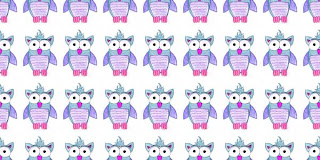
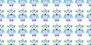
Repeat Pattern

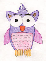
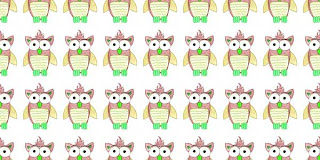
I wanted to experiment with making a repeat pattern from a little drawing I did, just to learn the skills so I could apply them to my current Graphics Project, where I want to create wrapping paper by repeating my logo. 

Click here to check out my logo and repeat pattern on my other blog.
Original Image.
Repeat Pattern.
These are the steps I took to create these:
  • Firstly I rezised my image to a easier comprehensible size in this case 300 x 400 pixels (resolution = 150).
  • I then adjusted my image with the Levels and Curves.
  • Then I seleted Offset (on the Filter Menu) and added half the size on each side and I made sure I selected Wrap Round option. 
  • I created a much bigger new document (2400 x 3200 pixels).
  • To create the repeat pattern, I selected all of my new image and copied and pasted it onto the new document, many times and aligning each piece.
  • To finish, I flatten my image to make it all one layer.
To change the colours of the design and make different versions, I used the Hue/Saturation Adjustment. 

Brown.
Blue and Purple.
Blue and Green.
Green.
I really enjoyed creating these images and it wasn't too hard to understand. :)

Tuesday, 21 February 2012

Superimposing on Photoshop


Edited Image

Superimposed on Street Wall.

Superimposed on Brick Wall - My favourite out of the 2 images.


Coca-Cola Image 1.


Coca-Cola Image 2.

Coca-Cola Image 3.

I chose a Coca-Cola Glass Bottle and Giraffe photo form the Internet which i then transformed into a stencil by adjusting its threshold. Next to smooth out part of the image I used Palette Knife option on the Filter Tab. Next I chose 3 different locations for my stencil to be placed on. To place the images I used Free Transform and then Transform - Distort to alter the perspective.
Then to get rid of the white background of the stencil I changed its Blending Mode to Multiply.

For Coca-Cola Image 2, I placed the stencil behind the man sat on the floor by selecting him with the Magic Wand Tool and Pasting him onto a new layer, where I resized him a little. I then put the Stencil inbetween the Man Layer and Underpass Layer.

Tuesday, 31 January 2012

Wood Block Effect on Photoshop

These images are supposed to look like a wood block print.

How I made these images:
  • I scanned in my image, I drew it making sure each line was a double line as this is to represent the thick line you would carve out of a woodblock.
  • Next I added a new layer.
  • I selected the parts of my image with the magic wand tool and filled in colour with the Bucket Tool on my new layer. 
  • Once completely coloured I deleted the background layer and flatten my image.
  • With a picture of a wood texture I found online, I changed it to Black & White, then adjusted the Curves and Inverted the image.
  • I then moved it onto my image and put it as the layer behind.
  • To finish I changed the the top layer's Blending Mode to Screen. 

Multi-coloured Print.
I then decided to try and make the block print more realistic by using just one colour as you usually do when creating a block print.
Pink Version.

Next using Hue/Saturation Adjustment on the image above I made this image...
Blue Version.
Coffee Cup Print.


Tuesday, 17 January 2012

Painting on Photoshop


  • I firstly sketched out my jug and scanned it into Photoshop. 
  • I then changed the curves of my image to make it clearer. 
  • Using the Magic Wand Tool I selected different areas each time. I painted it using one of the Dry Media Brushes, for a more textured effect.
  • I made sure the brush had a 10% opacity so that I could apply the colour in layers. 
  • I then gave the jug a ground shadow, by selecting the background with the Magic Wand Tool.
  • To finish off, I made areas darker with the Burn Tool and lighten areas with the Dodge Tool. Both these tools were good as they added tone without adding extra layers of paint. 

  • The second image is the greyscale version of my original, done with Desaturate Adjustment.
  • The third image was done by Inverting my greyscale image.


Tuesday, 10 January 2012

Depth of Field Photos.

SLR cameras are usually used to produce this effect. 


With a high lens aperture (small f-number) you will create a large depth of field where the foreground and the background will all, more or less be in focus. 

Therefore with a low lens aperture (big f-number) you will create a shallow depth of field where only your selected object will be in focus, usually in the foreground. 


Large Depth of Field.
Shallow Depth of Field.

How I created these images:
  • My aim was to fake the depth of field and so I collected 2 images, the parrots and the forest background. 
  • Using the Quick Selection Tool, I selected the parrots.
  • Before moving them onto my other image, the forest background, I feathered my selection to soften the outline of the parrots.
  • Once placed on the new background, I rescaled and position the parrots. 
  • I then saved this image.
  • To create the shallow depth of field, I blurred my image using the Gaussian Blur to 1.5 Pixels. 
  • I then saved this image.